

Should Your Website Be Mobile-friendly or Mobile-responsive?
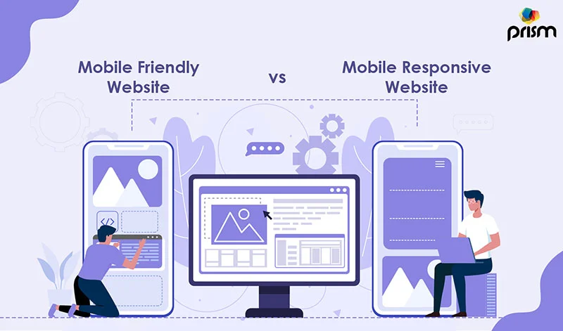
Mobile-Friendly Website Vs Mobile-Responsive Website
Let's take a look at each one individually.
Mobile-friendly
Mobile-friendly websites are often pages that are smaller versions of what you'd see on a desktop screen. While this makes it possible for mobile visitors to view, browse, and use the site, it does not make it simpler. Login and password bars become difficult to click, buttons are easily "fat-fingered," and user experience is frequently neglected.
Mobile-responsive
Mobile-responsive websites have pages that have been reformatted to replicate what you see on a desktop computer. Instead of downsizing everything, clickable objects are enlarged, and images are scaled and converted. This also protects the user's experience while switching from a vertical to a horizontal view on the mobile device.
To put it another way, mobile-friendly means "viewing" the same information on a desktop and a mobile device. The term "mobile-responsive" refers to the ability to "experience" the same information on a mobile device as on a desktop.
Why Should Website be Mobile-Friendly?
Only a few years ago, creating a mobile-friendly website was the only thing you could do to prepare yourself for the mobile web. It was obvious — people would access the internet on their phones and tablets more than they would on their computers. This meant optimizing your site to be mobile-friendly would get you ahead of most of your competitors.
Nowadays, this has changed. Google announced at the beginning of 2017 that it will favor mobile-responsive sites over mobile-friendly ones by this year. This might appear as a false dichotomy, but it changes a lot in how we structure our websites now and in the future.
Another reason businesses and people choose mobile-friendly pages is that the terms are frequently interchanged, and inexperienced website developers are often unaware of the differences.
In short, unless you have a long-term business plan that includes developing a mobile app, it's advisable to stick with a mobile-responsive design.
Advantages of Mobile-Responsive Website
The advantages of mobile responsiveness were briefly discussed above. However, here are some of the more detailed advantages of having a mobile-responsive website rather than a mobile-friendly one:
1. Text size and styling
One of the most visible distinctions between mobile-friendly and mobile-responsive websites is the matter of whether or not you need to zoom in to read the Home page.
You can be staring at paragraphs that look like ants clumped together in a neat arrangement because a mobile-friendly website allows you to use the full functionality of a website but does not change the screen size.
To read it, you must zoom in on your smartphone and then scroll left and right to view the edges of the words, which is even worse.
This text will be expanded and converted to fit on the smaller screen in mobile-responsive designs.
2. Images and graphics
Images, like text, frequently require touch-ups in order to be properly viewed on a mobile device. You can rapidly switch between desktop and mobile views with a mobile-responsive website design to check how each picture will appear. This gives you the flexibility to zoom in and out as needed.
With Constant Contact, the A.I. system will automatically alter these sizes as needed. It does, however, provide you the ability to alter them as you see appropriate.
3. Buttons and icons
On mobile devices, buttons are known for being inconvenient. That's why buttons on a mobile-responsive website are bigger to fit the smaller screen and have enough space between them to be distinguishable.
4. Vertical and horizontal views
Switching between views on mobile-friendly websites might result in the loss of text, graphics, or functionality. Mobile-responsive websites take this into account and plan for both scenarios.
5. Faster loading times
Having a mobile-responsive website entails more than just changing the size. It really reformats the backend to make mobile-friendly sites load faster. The phone is probably one-tenth to one-twentieth the size of a laptop computer, perhaps even one-twentieth the size of a desktop computer.
As a result, the hardware within is a fraction of what you'd find on a desktop. Mobile-responsive websites accommodate this and make page loading faster. There are two more advantages to a quick loading time:
- Lower bounce rates — When smartphone, tablet, or other mobile visitors are forced to wait ten seconds for a page to load, they quickly close the tab (a bounce from your website) and go to another website. Actually, ten seconds is a stretch (try 3 or 4 seconds). You get less of that with faster load times, which means lower bounce rates.
- Higher conversion rates — There are several processes involved in guiding a customer "down the sales funnel." Generally speaking, you must first raise awareness of your product or service, then build interest, demand, and finally, action. This necessitates a smooth transition between each phase; if this is hampered by poor mobile web design, you will lose conversions. However, if your website is mobile-friendly, you may see increased conversion rates as a result of the improved user experience.
If you're still unsure about why responsive design is important for websites, we'll explain who benefits from it.
Who needs a mobile-responsive website?
A mobile-responsive website should be used by everyone.
But realistically, your audience is the most important element. Take, for example, a restaurant. People frequently look for dining options by typing in general terms such as "food near me" or more precise terms such as "Italian food in San Antonio."
Furthermore, the vast majority of these searches will be conducted on a mobile phone. Restaurants must cater to their target demographic by developing a mobile-friendly platform that allows them to navigate the menu, hours of operation, delivery options, and more.
Restaurants aren't the only ones requiring mobile-friendly websites. If your business model includes the following elements, mobile responsiveness is a must.
- Increasing your blog's readership.
- displaying images or photos of travel, food, hair makeovers, and other topics.
- Selling items or services using an e-commerce platform.
- Software for scheduling, such as delivery applications or calendar bookings.
Build a Mobile-Responsive Website?
The method of building a mobile-responsive website is similar to that of creating a standard website. If you're unsure how to create a responsive website, Prism Digital, one of the best web development agencies in Dubai is here to help.
If you want to do it on your own, follow these instructions.
The easier way is to choose a template or a design. Keep the following basic components in check while working on the website:
1. Navigation style
Do you want your website's navigation (or menu) bar to be detailed out at the top of the page? Do you want it to be on the side or in the middle? Or do you want the header image to be the only thing you see, with the navigation in the corner as a button?
2. Header image
They say a picture is worth a thousand words. Decide whether you want the page to be shared with text or with a header picture (or video).
3. Header text
What do you want to communicate about your company or blog in the header text? Consider your Home page in the same way that you would meet a new acquaintance. What can you say to entice them in this situation?
4. Customize each element of the layout
You have complete freedom to modify anything you choose. Use several color palettes, graphics, text blocks, and buttons to customize the website. Everything will be mobile-responsive.
5. Create the pages
For starters, many websites must include the following five pages:
- Home page
- Products or Services page
- Contact page
- About page
- Gallery or Blog page
6. Fill in the sections on each page with enough information
Using an e-commerce platform, you can showcase your items or services. Add photos of happy customers or verified reviews to your gallery page. Write unique blog entries to demonstrate thought leadership in your sector. It's entirely up to you how you construct each page; just remember to maintain a single focus throughout.
7. Switch between desktop and mobile previews
If you want to know how your website will be seen on different devices, click the button that says, “mobile view.” You’ll notice a few things: -The URL will change. -The layout will adapt so things fit on smaller screens. -You’ll see separate preview images of desktop and mobile devices at the top of your browser.
To enable this feature, you need to go to Theme Options -> Mobile Preview. You can switch between mobile and desktop preview by clicking on the iOS or Android icons next to the screen size description, just above the editor.
8. Use company logo
Create a fully customizable designer logo. logos play a major part in branding, whether it's for your company, sports team, or freelance design business.
9. Always get design advice from experts
Get help from experts who excel in this field. There are many web development companies that will help you overcome your shortcomings and put forth a fabulous front for your website.
Keep in mind that Mobile-friendly and mobile-responsive are two different things; think of them as two separate sides of the same coin. To be truly mobile-friendly, you need to figure out exactly how your site functions across a range of devices, and then use CSS media queries to make the layout adjust automatically. This isn’t easy, but it can be done.
However, it’s much easier to use a responsive design from the start, as this will require fewer changes to your source code every time you add a new device (and additional resolutions) to your list.
Conclusion
The bottom line is: since most websites are viewed on mobile devices today, it makes little sense to have a site designed for desktop computers only. Mobile responsive website design is, therefore, a logical choice and has been proven over time to be the simplest solution.
This is it for today’s blog. I hope you enjoyed reading it. Be sure to share your feedback with me or reach out to me if you have any queries. If you are a business owner who needs a mobile responsive website, contact Prism Digital, the best web development agency in Dubai, and our expert web developers will build a bespoke, fully mobile responsive website that resonates with your brand values. See you on the other side. Thank you.

About The Author: Lovetto Nazareth
Lovetto Nazareth is a digital marketing consultant and agency owner of Prism Digital. He has been in the advertising and digital marketing business for the last 2 decades and has managed thousands of campaigns and generated millions of dollars of new leads. He is an avid adventure sports enthusiast and a singer-songwriter. Follow him on social media on @Lovetto Nazareth
Post Your Comment!
Recent Blogs
View Blogs
AI-Based Attribution Models Explained: 5 Questions Every Executive Is Asking in 2026
How SEO Services in Dubai Help You Rank in Google AI Overview (2026 Guide)
From SEO to GEO: A Dubai Agency Guide to Winning in Generative Engine Optimization

Google Business Profile Optimization Guide for UAE SMEs in 2026

Support
Phone: +971 55 850 0095
Email: sales@prism-me.com
Location: Prism Digital Marketing Management LLC Latifa Tower, Office No. 604 - West Wing World Trade Center 1, Sheikh Zayed Road Dubai, UAE
Subscribe
Join our newsletter to stay up to date on features and releases.
By subscribing you agree to our Privacy Policy and provide consent to receive updates from our company.